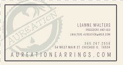
Here is my final changes I did to my stationary for the branding project. I also added a 2nd application (bonus project) seen below. It is going to be a letter that will come in the package when someone orders earrings from our company. There will be photos to come of everything put together in the folder.
VisComm 1 FA12 WaltersLeAnne
Friday, December 7, 2012
Wednesday, December 5, 2012
BRANDING - Ipad design
Here is my finished Ipad design. There are subtle diferences on each to show different rollovers, buttons, and drop downs. Below is my homepage as it would load on first.
Here is an example of a clicked button (or rollover for web) in the icon
Below is another example of a rollover link in the text
Navigation pull-down bar
And then the hover state for the navigation
Now is my subsequent page, or my shopping page as it would load once clicking on the product. The main point of this site is that you can personalize earrings to anything you want to change... hence the "make it your own" button which will be explained further below
This is the example of the drop-down that you slide down after chosing to "make it your own". customers would be able to then click on the part they want to change in the picture and then select the shape, gem, and metal they would like to swap with it.
This can be done by swiping through the options like so...
BRANDING - web wireframe
Here is both the home page and sub page of a mockup site I will be creating for Aureation earrings. there are a lot of rollovers and button states that I can't show here, I will show them on my final design with images added.
Monday, November 26, 2012
BRANDING - stationary
Here is my stationary for my company Aureation.
Envelope
Shipping label
Business card
Letterhead with copy
Friday, November 16, 2012
BRANDING - 3 in-progress logo's
I started with the logo above that I based off of a stamp. I wanted it to seem like an actual stamp that would be on a package and thought about creating an actual stamp by hand to get that look. I had other ideas that I want feedback on. Hence the logo's below. The first one is more of the clean world idea. This still plays with the idea of fairtrade and a fair world, but in a cleaner way which describes our company more. I also felt the handwriting was more elegant and fit with the earrings we would be selling. The final design is just another try at the stamp idea that is a little more distressed looking.
BRANDING - 50 more sketches
These are my 50 more sketches that I went more in-depth into one of my first sketches that I thought worked the best. I played with placement of the name as well as different designs. eventually I came up with 3 that I felt worked the best. I wanted to play off of a stamp (based off of the fair trade stamp) and then I also started to see a world and played around with a cleaner version.
Tuesday, November 13, 2012
BRANDING - logo thumbnail sketches
Here are my 100 thumbnail sketches of possible logos and also names. I have a few directions that I might be going towards. The largest image at the bottom is a possible logo that would play off of the use of fairtrade metals and gems that our company uses. I also wanted to play with the use of gold's periodic symbol Au, thus coming up with the name Aureation meaning to make gold. I also liked the play on the word creation since our company gives the users the choice to create their own personal earrings. A random name I found interesting was Sgnirrae which is earrings spelled backwards.
Subscribe to:
Comments (Atom)


